
 A feature often used by Scrum teams to view the progress of a Sprint is the burndown chart. Through this chart it is possible to monitor how the team is in relation to the deliveries planned for the Sprint in question. Thus, daily it is possible to predict possible problems in the delivery and thus take actions in order to minimize them, as can be seen in the post “Burndown Chart: Measuring the Progress of Your Sprint.” But what about the progress of the project as a whole? How can you check if the project is “moving forward”? How do you base or adapt to possible changes in scope? In today’s post, we present how another graph, the burnup chart, can help answer these questions, through 4 analysis tips on this chart.
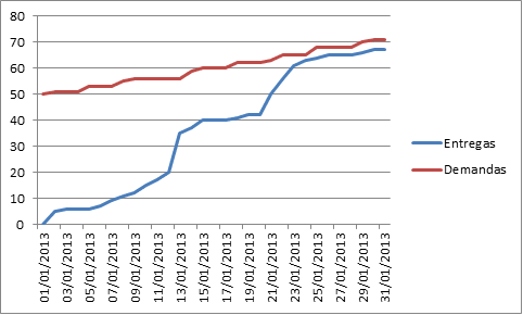
The burnup chart provides information on the progress of the project as a whole and not just on a sprint as in the case of the burndown chart. It clearly shows at what point the staff is (Deliverables) and where it should arrive (Demands). As we can see in the figure below, the burnup graph is built on two axes: on the horizontal axis times the time factor and on the vertical axis we have the factor that represents the working amount. This amount of work can be represented in points, effort measures, hours, etc., according to what is used in the day to day work by the team.
The graph shows two lines:
- Blue: represents the amount of work delivered to the client. That is, it represents the total stories (or backlog item) delivered throughout the project.
- Red: represents the amount of work being requested by the customer. That is, it represents the total stories (or backlog item) created for the project.
The distance between these two lines represents, each day (or another unit of time used), the amount of work that remains to be delivered in order to achieve the project objective at that moment.
With this brief summary about the burnup chart, we present 4 interesting reviews that can be made through it.
1. Scope X Deliveries
The most immediate analysis we can do about this chart is the comparison of how much the project scope has evolved with how much work has been delivered over time.
If the scope of the project starts to grow much more than the amount of work delivered, then we may have a problem! For the project is growing in demands, but the speed of deliveries of the team is not keeping pace with the growth of these demands.
Points of attention:
- Perhaps it is time to study a possible increase in the team in order to increase the speed of deliveries or a study on what may be impacting the speed of deliveries.
- Or a study on why the demands are growing so quickly.
- In addition, comparing the amount of work delivered with the amount of work to be done over time allows us to measure the distance between what we want and what is being served through the project.
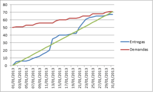
2. Regularity of deliveries in front of the project objective
Another interesting analysis is about the regularity of deliveries from the project to the goal.
For this analysis we draw a line from the origin of the graph to the point that represents the total demand on the last day represented in the graph, according to the green line shown in the figure below. If the blue line is always near the green line, the project is more balanced.
In addition, with this line it is possible to evaluate if we are advanced or delayed with the deliveries. If the blue line is above the green line, we are early. If the blue line is below the green line we are late.
Of course, this idea of delayed or advanced depends on the characteristics of the project, even because daily deliveries will hardly follow a regularity.
3. Classification of work amounts into categories
Another interesting analysis that can be done with the burnup chart is the separation of amounts (demanded and delivered) into categories.
For example, in a software project we can have the categories Bug, Technical Stories and New Features. So we would have a line of the amount demanded and an amount line delivered for each category. This information could be viewed in a single graph so that for the classification of the example we would have 6 rows in our burnup chart. Or we could separate in three graphs, one for each category with a row of the demanded amount and a row of the amount delivered in each. This analysis allows us to study not only how much is being delivered as a whole, but also the nature of what is being delivered.
We can analyze in which periods more bug fixes were delivered or in what period we released more new features, for example. Or maybe studying when more demands are coming for bug fixes … Is it after many new features deliveries? And before?
Finally, by separating the amounts of work represented in the graph into categories we can make a correlation between the deliveries and demands of the different categories and seek strategies in order to optimize deliveries in order to reach the project objective.
4. Analysis of the quality of deliveries
An analysis that I recently did in a project that I participate in, and that can even be seen as an analysis of the separation of the amounts of work into categories, is a study on the growth of the demands of bug fixes in front of the other demands of the project. That is, an analysis that helps us measure the quality of the work being delivered.
If the amount of bugs found starts to grow much more than the other demands or if the amount of bugs starts to grow more than the amount of work delivered, it can be a sign of problem, probably related to the quality of what is being delivered through from the project.
In addition, this situation shows that the work that the team is delivering is at the same time generating more work (correction of bugs) for the own team. Thus the distance between the blue and red lines of the burnup graph will be increasing, when in fact what is wanted is that these lines approach and at the end of the project cross. From these 4 analyzes we can extract important information about the the project in question, not only evaluating the total work delivered, but also the nature of the project being delivered. Other analyzes can also be done according to the characteristics of the project.
Therefore the burnup chart provides a powerful and yet flexible tool so that you can evaluate the progress of a project as a whole over time, allowing actions to be taken to achieve the goal of the project. Is that you? Do you use the burnup chart? How do you do your analysis? Share with us through the comments! Until the next post!


